An attached property is a concept defined by XAML. An attached property is intended to be used as a type of global property that is settable on any object. In Silverlight, attached properties are typically defined as a specialized form of dependency property that does not have the conventional property "wrapper".
Declare Dependency Property in static class.It is static because it describes a property that is valid for that class at all, not just for some specific instance of it.Register this Dependency Property in static Constructor.
At last define the get and set method inside the static class. These methods represent simple static type-safe wrappers for the GetValues and SetValue methods of the extended Dependency Object.Note that every attached property must have such methods defined because they are used by Silverlight when the value of the attached property should be changed from within XAML. The naming convention is pretty straightforward ‘Set + Property name’ and ‘Get + Property name’.
Step 4
Mapping ImageButtonBehavior class in UserControl XAML,it is look like this
Finally it is look like on UserControl tag
Step 5
Now add two Button control on Page,it is look like this

Click on Image for better view.
Step 6
Add the following code to define the style for button in UserControl.Resources,it is look like this
In here we have created style that we can place image along with button text using DataTemplate (ContentTemplate Property) of Button Control.
Step 7
Finally Set a ImageButton Attached Property and apply style to Button Control,it is look like this
Full XAML Code
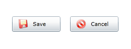
Run the Project.
Output
 Download
Download Source Code
Why and When we create an Attached Property???
One purpose of an attached property is to allow different child elements to specify unique values for a property that is actually defined in a parent element. A specific application of this scenario is having child elements inform the parent element of how they are to be presented in the user interface (UI).
You might create an attached property when there is a reason to have a property setting mechanism available for classes other than the defining class.
In this post i will show you how to create a Image Button using Attached Property in Silverlight 5.
Step 1
Create a Silverlight Application and give the solution name as SolImageButton_AP.

Click on Image for better view.
Select Silverlight Version.

Click on Image for better view.
Note : Select Web Project Type as ASP.NET Web site.
Step 2
Add the two Images in Solution it is look like this

Click on Image for better view.
Note :Download Source Code and you can get Images from Solution.
Step 3
Now we will create Attached Property for Button which add image on Button control.it is look like this.
using System;
using System.Net;
using System.Windows;
using System.Windows.Controls;
using System.Windows.Documents;
using System.Windows.Ink;
using System.Windows.Input;
using System.Windows.Media;
using System.Windows.Media.Animation;
using System.Windows.Shapes;

namespace SolImageButton_AP
{
    public static class ImageButtonBehavior
    {
        #region (Step 1) Dependency Property Declaration

        public static readonly DependencyProperty ImageButtonProperty = null;

        #endregion

        #region (Step 2) Register Dependency Property in Static Constructor

        static ImageButtonBehavior()
        {
            try
            {
                ImageButtonProperty=DependencyProperty.RegisterAttached("ImageButton",typeof(ImageSource),typeof(ImageButtonBehavior),new PropertyMetadata((ImageSource)null));
            }
            catch (Exception ex)
            {
                throw new Exception(ex.Message);
            }
        }

        #endregion

        #region (Step 3) Get and Set Accessors static Method

        public static ImageSource GetImageButton(DependencyObject DoObj)
        {
            return DoObj.GetValue(ImageButtonProperty) as ImageSource;
        }

        public static void SetImageButton(DependencyObject DoObj, ImageSource ISObj)
        {
            DoObj.SetValue(ImageButtonProperty, ISObj);
        }

        #endregion
    }
}
Declare Dependency Property in static class.It is static because it describes a property that is valid for that class at all, not just for some specific instance of it.Register this Dependency Property in static Constructor.
At last define the get and set method inside the static class. These methods represent simple static type-safe wrappers for the GetValues and SetValue methods of the extended Dependency Object.Note that every attached property must have such methods defined because they are used by Silverlight when the value of the attached property should be changed from within XAML. The naming convention is pretty straightforward ‘Set + Property name’ and ‘Get + Property name’.
Step 4
Mapping ImageButtonBehavior class in UserControl XAML,it is look like this
xmlns:Behavior="clr-namespace:SolImageButton_AP"
Finally it is look like on UserControl tag
<UserControl x:Class="SolImageButton_AP.MainPage"
 xmlns="http://schemas.microsoft.com/winfx/2006/xaml/presentation"
 xmlns:x="http://schemas.microsoft.com/winfx/2006/xaml"
 xmlns:d="http://schemas.microsoft.com/expression/blend/2008"
 xmlns:mc="http://schemas.openxmlformats.org/markup-compatibility/2006"
 mc:Ignorable="d"
 xmlns:Behavior="clr-namespace:SolImageButton_AP"
 d:DesignHeight="300" d:DesignWidth="400">

</UserControl>
Step 5
Now add two Button control on Page,it is look like this
<Grid x:Name="LayoutRoot" Background="White">
      <StackPanel Orientation="Horizontal" HorizontalAlignment="Center">
         <Button Content="Save" Height="32" Width="100" Margin="10,0"/>
         <Button Content="Cancel" Height="32" Width="100" Margin="10,0"></Button>
      </StackPanel>
</Grid>
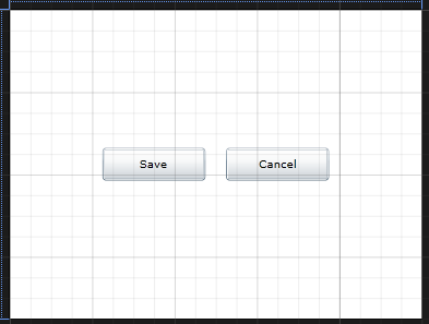
Click on Image for better view.
Step 6
Add the following code to define the style for button in UserControl.Resources,it is look like this
<UserControl.Resources>
   <DataTemplate x:Key="ImageButtonDataTemplate">
            <StackPanel Orientation="Horizontal">
                <Image Source="{Binding Path=(Behavior:ImageButtonBehavior.ImageButton),RelativeSource={RelativeSource Mode=FindAncestor, AncestorType=Button}}" Stretch="Fill" Height="20" Width="20" HorizontalAlignment="Left" Margin="10,0,10,0"></Image>

                <TextBlock Text="{Binding Content, RelativeSource={RelativeSource Mode=FindAncestor, AncestorType=Button}}" HorizontalAlignment="Center" VerticalAlignment="Center"></TextBlock>
            </StackPanel>
    </DataTemplate>
    <Style x:Key="ImageButtonStyle" TargetType="Button">
 <Setter Property="HorizontalAlignment" Value="Stretch"/>
        <Setter Property="HorizontalContentAlignment" Value="Stretch"/>
        <Setter Property="ContentTemplate" Value="{StaticResource ImageButtonDataTemplate}"/>
    </Style>
</UserControl.Resources>
In here we have created style that we can place image along with button text using DataTemplate (ContentTemplate Property) of Button Control.
Step 7
Finally Set a ImageButton Attached Property and apply style to Button Control,it is look like this
<Grid x:Name="LayoutRoot" Background="White">
 <StackPanel Orientation="Horizontal" HorizontalAlignment="Center">
  <Button Content="Save" Height="32" Width="100" Margin="10,0" Behavior:ImageButtonBehavior.ImageButton="save.png" Style="{StaticResource ImageButtonStyle}"/>
                <Button Content="Cancel" Height="32" Width="100" Margin="10,0" Behavior:ImageButtonBehavior.ImageButton="cancel.png" Style="{StaticResource ImageButtonStyle}"></Button>
 </StackPanel>
</Grid>
Full XAML Code
<UserControl x:Class="SolImageButton_AP.MainPage"
 xmlns="http://schemas.microsoft.com/winfx/2006/xaml/presentation"
 xmlns:x="http://schemas.microsoft.com/winfx/2006/xaml"
 xmlns:d="http://schemas.microsoft.com/expression/blend/2008"
 xmlns:mc="http://schemas.openxmlformats.org/markup-compatibility/2006"
 mc:Ignorable="d"
 xmlns:Behavior="clr-namespace:SolImageButton_AP"
 d:DesignHeight="300" d:DesignWidth="400">

 <UserControl.Resources>
  <DataTemplate x:Key="ImageButtonDataTemplate">
            <StackPanel Orientation="Horizontal">
                <Image Source="{Binding Path=(Behavior:ImageButtonBehavior.ImageButton),RelativeSource={RelativeSource Mode=FindAncestor, AncestorType=Button}}" Stretch="Fill" Height="20" Width="20" HorizontalAlignment="Left" Margin="10,0,10,0"></Image>

                <TextBlock Text="{Binding Content, RelativeSource={RelativeSource Mode=FindAncestor, AncestorType=Button}}" HorizontalAlignment="Center" VerticalAlignment="Center"></TextBlock>
            </StackPanel>
        </DataTemplate>
  <Style x:Key="ImageButtonStyle" TargetType="Button">
   <Setter Property="HorizontalAlignment" Value="Stretch"/>
            <Setter Property="HorizontalContentAlignment" Value="Stretch"/>
            <Setter Property="ContentTemplate" Value="{StaticResource ImageButtonDataTemplate}"/>
        </Style>
 </UserControl.Resources>

 <Grid x:Name="LayoutRoot" Background="White">
  <StackPanel Orientation="Horizontal" HorizontalAlignment="Center">
   <Button Content="Save" Height="32" Width="100" Margin="10,0" Behavior:ImageButtonBehavior.ImageButton="save.png" Style="{StaticResource ImageButtonStyle}"/>
            <Button Content="Cancel" Height="32" Width="100" Margin="10,0" Behavior:ImageButtonBehavior.ImageButton="cancel.png" Style="{StaticResource ImageButtonStyle}"></Button>
  </StackPanel>
 </Grid>
</UserControl>
Run the Project.
Output

Download Source Code


